
BRANDING


LOGO
SECONDARY


DESIGN PROCESS
BRANDING
CLIENT
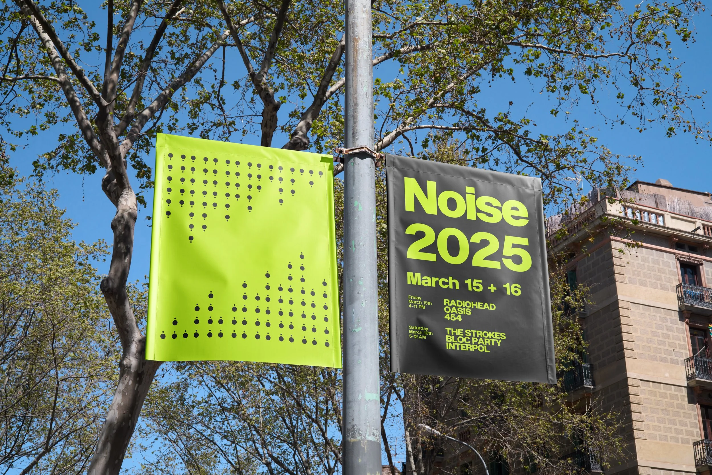
Noise Music & Arts Fest
YEAR
2024

Noise embraces minimalism in both its visual language and overall experience. It believes in stripping away unnecessary elements to focus on the core of what matters: the music and its connection to the audience.
The objective was to amplify the spirit of the festival—raw, independent, and unapologetically loud—while refining its visual identity to meet the expectations of a new generation of festival-goers. The redesign celebrates the festival’s roots in underground culture but gives it a modern, legible, and cohesive face that can stretch across digital, print, and experiential touchpoints.
We are Noise.
A music and arts festival built on energy, independence, and unfiltered sound. Born from the underground and raised on raw creativity, Noise exists to amplify the voices that push culture forward—from breakout acts to legendary headliners.
Driven by the same ethos that defines the music we champion: bold, stripped down, and full of personality. We crafted a visual system that speaks loud without clutter
CLIENT
TYPOGRAPHY
PRIMARY
Enduro
Black
ABCDEFGHIJKLMN
OPQRSTUVWXYZ
abcdefghijklmnopqrstuvwxyz
0123456789!@#$%^&*()
YEARS
1957, 2020
FOUNDRIES
Monotype, Very Cool
DESIGN PROCESS
By using simplified speaker forms arranged to form an abstract "N," we created a logo that instantly evokes minimal form with maximum character.
It’s geometric and highly legible, yet it doesn’t feel sterile. There’s a playful weirdness to it. The result is a visual identity that feels fresh, recognizable, and deeply tied to the sound-first ethos of the festival.
TERTIARY
POP PINK
#FF00FF
SKY BLUE
#00C1FF
DESIGN PROCESS
We embraced a high-energy palette centered around a signature lime green (#D2FF05), with support from loud primary tones like Pop Pink, Sky Blue, and Red Pink.
The colors are used unapologetically—flooded, contrasted, and layered—so the visuals feel just as intense as the music.
COLORS
LIME
#D2FF05
RED PINK
#FF006E
WHITE
#FFFFFF
BLACK
#000000
SECONDARY
DESIGN PROCESS
The system uses Enduro for its boldness and brutal energy—perfect for punchy headers and impactful branding moments—paired with Neue Haas Grotesk, a modernist workhorse that lends structure and clarity to information-heavy contexts.

DESIGN PROCESS

Enduro
Bold
ABCDEFGHIJKLMN
OPQRSTUVWXYZ
abcdefghijklmnopqrstuvwxyz
0123456789!@#$%^&*()z


BUSINESS CARD


ICONS
Music Notes
They’re iconic and minimal, and are also one of the few marks that capture what we understand as sound through visual connotation easily.
Stars
communicate excellence and top-tier presence without needing to say it out loud.
Speakers
Minimal yet powerful, the speaker is a recurring brand symbol that represents sound, volume, and culture.
USE
Perfect for any promotional events, giving the people an understanding for what we bring to the table.


